CASA1900
Rebranding and Graphic Consulting
CASA1900 is the rebrand of the bakery Ballaró in Mexico City, located in an iconic building in the neighbourhood of La Roma built in 1908 during the Porfiriato era.
The development of the concept was done in close collaboration with the architect of the project to ensure both the renovation of the space and the brand would feel integrated.

Combination Mark
Logomark
Logotype


Concept and Inspiration:
-
Natural textures
-
Handmade botanical illustrations
-
The sun and the moon
-
Geometric shapes
-
Earth colors
-
Plants and green color
-
Dynamism
-
The feminine and organic elements
The goal was a space that invites you to be present through design and nature.
A reflection of quality and tradition between a sophisticated and enthusiastic personality thanks to the graphic and architectural elements but that aims to transport you to a moment of isolation from the outside world where you can enjoy, relax and take care of yourself.
Elements designed and created for the project:
-
Brand book and basic brand elements like logo, color palette and correct brand usage.
-
Printed menu
-
Coasters
-
Labels
-
Illustrations and patterns
-
Wrapping and decorative paper
-
Paper cups design
-
Outdoor and Indoor signage
-
Stickers
-
To-go boxes
All graphic elements were delivered to the client revised and ready to print.
Main Color Palette
Secondary Color Palette
C 44% M 49%
Y 87% Y 23%
C 68% M 47%
Y 98% Y 46%
C 71% M 65%
Y 64% Y 70%
C 19% M 85%
Y 100% Y 9%
Web
#806A39
#404D23
#252525
#BC451F
Screen
R128 G106 B57
R64 G77 B35
R37 G37 B37
R188 G70 B39
Pantone
7756 C
5743 C
426 C
7598 C
Color Test


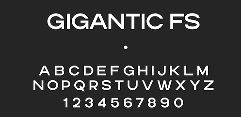
Main Typography

Secondary Typography
Mock Ups


The coffee shop has had a big impact on social media thanks to the good design, atmosphere and architecture, prices and service becoming one of the favorite spots of turists and locals alike.


Applied Graphic Identity On Site


